Goulian Aerosports

The Request:
Michael Goulian contacted us with a unique challenge. His airshow company required a new identity due to the conflicting main colors of his title sponsors. Additionally, he wanted a distinctive look to separate his airshow team from his flight school. Through multiple phone calls and brainstorming sessions, we developed three design directions, ultimately selecting one for its simplicity and visibility across various assets.
Scope:
Our goal was to create a dynamic logo that embodies the high energy and precision of Mike Goulian Aerosports, while reflecting his core values of “Passion, Dedication, and Excellence.” The logo needed to be easily recognizable and versatile enough to work alongside multiple title sponsors. After extensive brainstorming, three final designs were presented, with one chosen for its effectiveness and appeal.
Key Elements of the final logo:
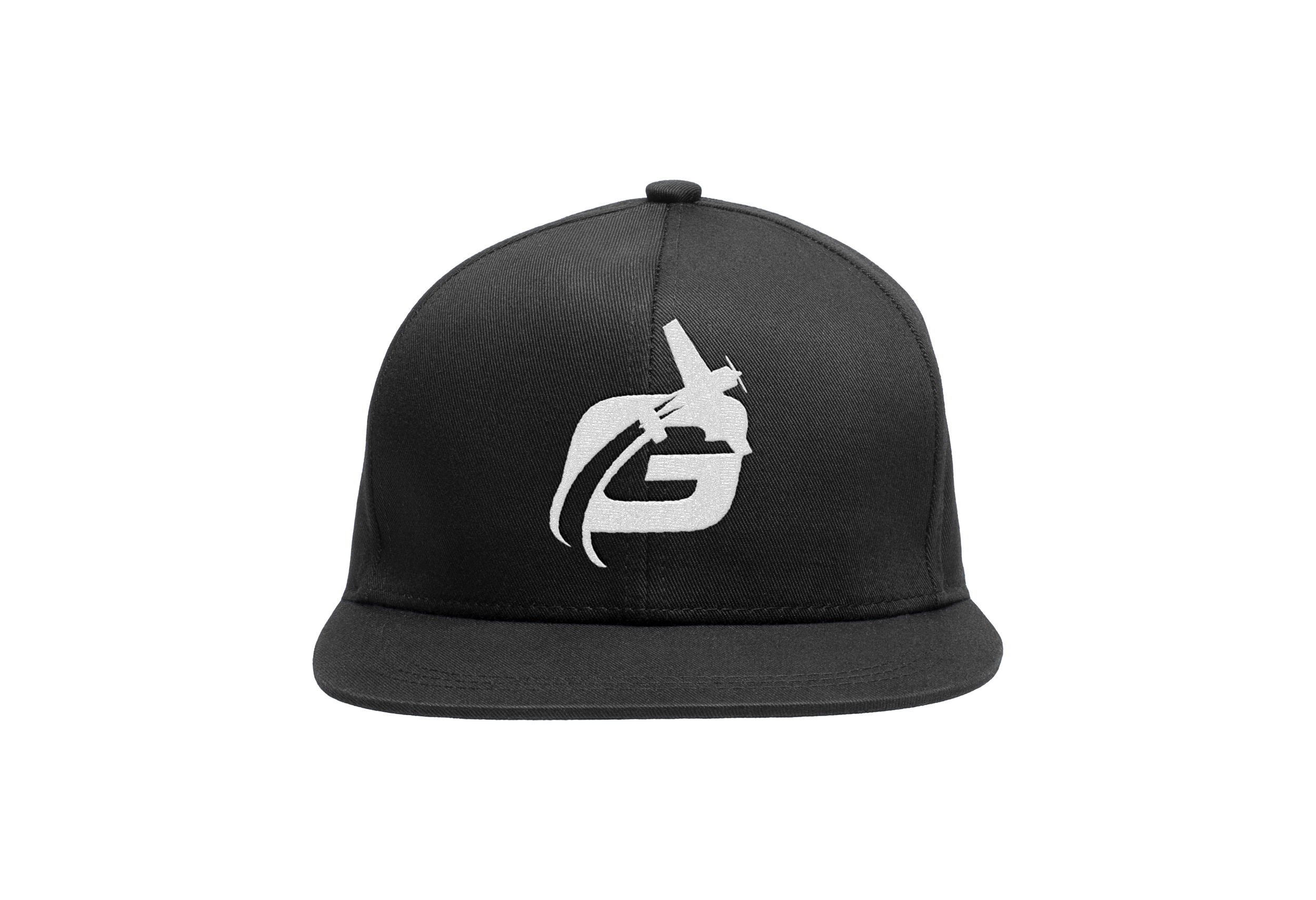
Dynamic 'G' with Aircraft:
The 'G' is designed to incorporate an aircraft flying through it, symbolizing Mike Goulian in action. This element adds a sense of motion and excitement, directly tying the logo to Goulian’s aerobatic performances.
The plane's trajectory through the 'G' suggests speed, agility, and precision, all qualities associated with Goulian's aerobatic expertise.
Stylized Airfoil Wing:
The line between "Goulian" and "Aerosports" is not just a divider; it's a stylized airfoil of a wing. This subtle detail reinforces the aviation theme and adds a layer of sophistication to the logo.
The airfoil shape contributes to the logo's aerodynamic feel, creating a visual representation of flight and performance.
Typography:
The font choice for "Goulian" and "Aerosports" is modern and clean, reflecting professionalism and clarity. The boldness of the text conveys strength and reliability.
The spacing and alignment are carefully balanced to ensure readability and aesthetic appeal.
Color Palette:
The use of a strong color palette enhances the logo's visibility and impact. The chosen colors reflect energy and passion, which are core attributes of the brand.
Contrast between the colors ensures that the logo stands out, whether it's displayed on aircraft, merchandise, or digital platforms.
Overall Composition:
The design maintains a cohesive look that is instantly recognizable and memorable. The integration of the aircraft into the 'G' creates a unique mark that sets the brand apart.
The clean lines and balanced composition ensure versatility, allowing the logo to be effectively used across various mediums and sizes.